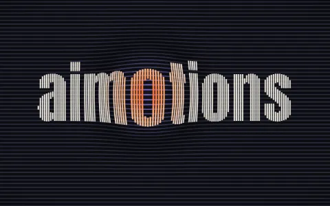
Bulge Warp Grid
op art hover · bulge distortion text · gravity well cursor · lens warp lines
Guide · website titles
Your main title is the first thing every visitor sees. A well-made animated title (letters that draw themselves, snap to the cursor, glow like neon or melt like liquid chrome) makes a page feel alive and memorable from the very first second.
This guide shows you how to pick an effect, ask an AI model for it with the right brief, and ship it so it stays fast, accessible and good for search.
Open the style you like and picture it with short words: titles of 4 to 12 letters look best.
It copies the style prompt plus a brief asking for a real, responsive, lightweight and accessible heading. Replace [TEXT] with your title.
Claude Opus 5.5, Claude Sonnet 5.5, Claude Fable 5.5, GPT-6 Astra or GPT-6.1 Sol, or a newer model. If you use a framework, ask for a component (React, Vue, Svelte…) or a custom HTML block for your site builder.
Use it as the animated main title of a website: keep the real words in the page as the main heading, so they stay selectable and readable by screen readers and search engines; size it fluidly from 360 px phones to wide desktops without shifting the layout; keep it lightweight (no external files, smooth at 60 fps) and never block the page from loading; pause the animation while it is off-screen and render heavy effects at a moderate resolution; make sure it never flashes more than three times per second; and show a still, fully legible title when the visitor prefers reduced motion. Deliver it as one self-contained HTML, CSS and JavaScript snippet.
Search engines and screen readers read the HTML, not the pixels. Keep the title as a real heading even when the effect is drawn on a canvas, and hide the decorative layer from assistive technology.
The title must not delay the largest content on the page (LCP). Show legible text from the first frame, reserve its space so nothing shifts (CLS), and skip heavy libraries: most effects fit in a few kilobytes.
When the system asks for less motion, show a still, legible frame. If the animation runs for more than five seconds, offer a way to pause it.
No effect should flash more than three times per second, the accessibility rule (WCAG 2.3.1) that protects people with photosensitive epilepsy.
Test the title on a 360 px screen. High contrast, short words and a size that scales fluidly with the width.
Stop the animation when the title scrolls out of view, and keep heavy effects (3D, shaders) at a sensible resolution.
Reactive styles amplify their effect on hover: letters bend, magnetize, ripple or scatter and spring back. Their prompts also ask for touch support, where the effect follows the finger.
On a blog or documentation, a subtle effect that settles quickly works better than one that competes with the text. Never hijack scrolling.
A selection of the styles that work best as website headings, in two families: reactive effects, which respond to the cursor, and effects that play on their own. Hover over a preview to start it; on touch screens, previews play by themselves while they are on screen.
Every reactive style in the library. Move the mouse over the preview and the letters bend, ripple, magnetize or scatter with it, then spring back. On touch screens a drawn cursor plays the preview for you, and the prompts ask for your version to follow the finger.
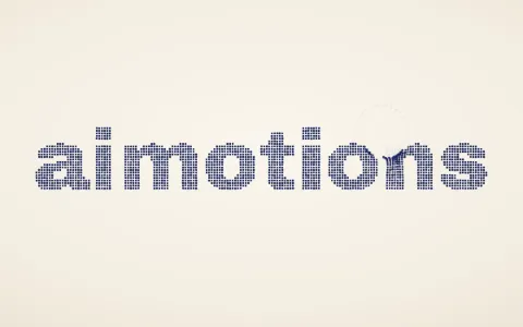
op art hover · bulge distortion text · gravity well cursor · lens warp lines
cloth simulation text · flag text effect · waving banner · fabric physics
magnifying glass effect · fisheye hover · lens distortion text · cursor magnifier
shatter on hover · broken glass text · glass break effect · cracked glass cursor
gooey cursor · metaball cursor · liquid cursor text · blob hover effect
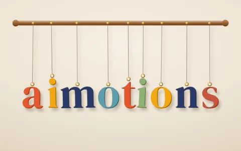
hanging letters · pendulum text · swinging letters hover · mobile letters
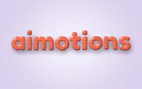
jelly text hover · soft body text · squishy text effect · wobbly letters
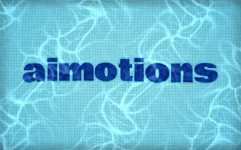
water ripple effect · ripple hover text · water distortion · pool water text
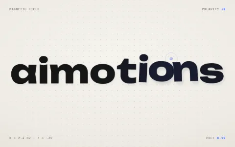
magnetic text effect · magnetic hover · cursor attraction text · spring letters
particle text hover · repel particles · interactive particles · dot text effect
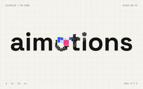
pixelate on hover · pixel dissolve effect · mosaic hover text · pixel trail cursor
spotlight text effect · flashlight hover · cursor light reveal · embossed text lighting
3d tilt hover · parallax hover effect · tilt card text · layered depth text
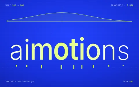
variable font hover · font weight on hover · proximity text effect · magnifying hover text
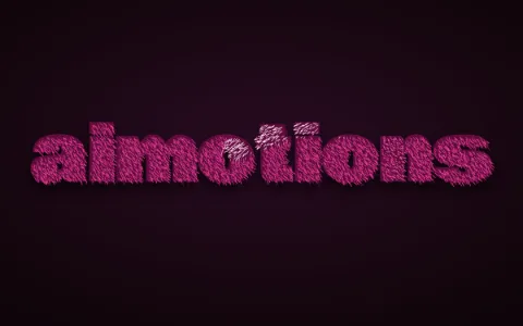
fur text · velvet hover effect · plush text cursor · brushed suede text
paint smear hover · liquify cursor · smudge text effect · wet paint text
A sample of kinetic type, light, materials, paper craft, analog video, retro games, interfaces, film titles and print; the full catalog has many more. They don’t react to the cursor (hovering only starts the preview) and they stay legible while they move.
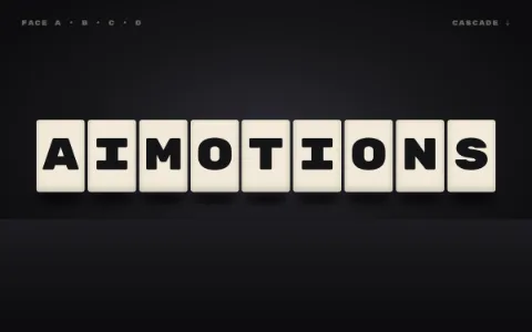
3d flip text · rotating cube letters · cube text animation · flip cascade
echo text effect · repeating text trail · stacked color echo · motion trail typography
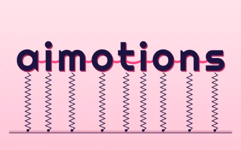
springy text · rubber band letters · elastic text animation · coil spring text
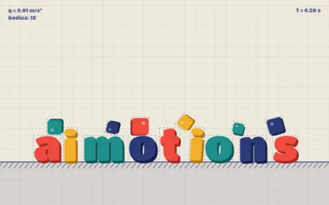
falling letters · physics text animation · rigid body typography · letters drop and collide
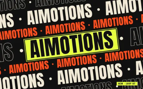
scrolling text rows · marquee typography · infinite text scroll · ticker tape type
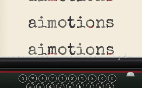
typewriter text animation · typing effect · typewriter reveal · manual typewriter
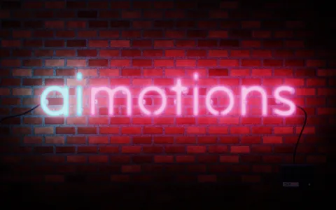
neon text · neon sign effect · glowing tube lettering · neon flicker
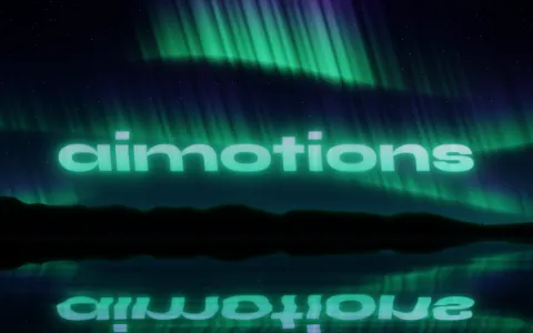
northern lights · aurora text · polar lights · aurora gradient
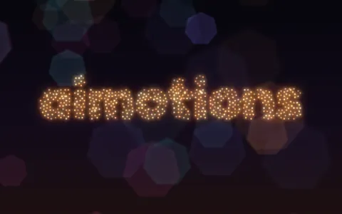
bokeh text · out of focus lights · fairy lights text · focus pull reveal
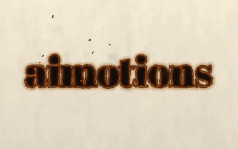
burning text · paper burn effect · fire reveal · burnt edges
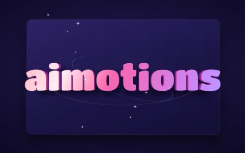
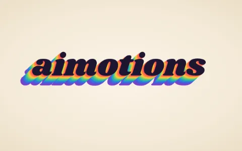
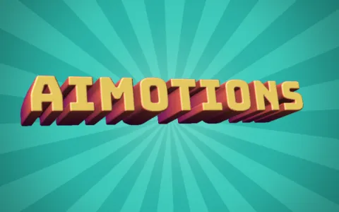
3d text · extruded letters · retro 3d type · block letters 3d
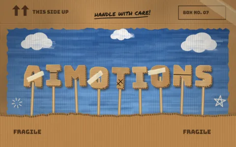
cardboard letters · corrugated cardboard text · cardboard cutout animation · diy cardboard type
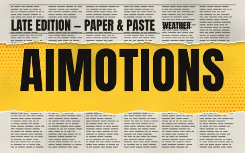
torn paper effect · ripped paper reveal · paper tear transition · ripped poster
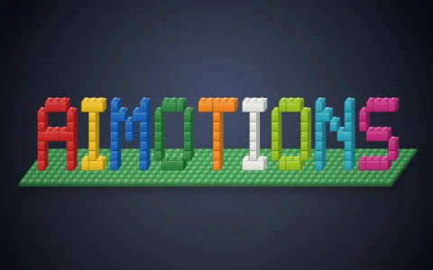
toy brick letters · building blocks text · brick build animation · stud bricks
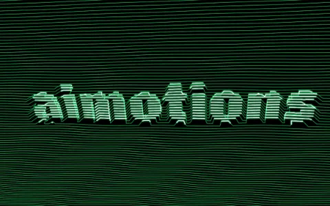
scan processor effect · video synthesizer · raster scan relief · scanline 3d text
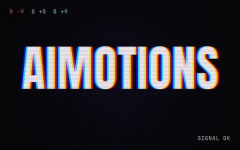
chromatic aberration text · rgb shift · glitch text effect · channel split
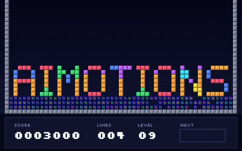
falling blocks game · tetromino animation · block puzzle text · stacking blocks letters
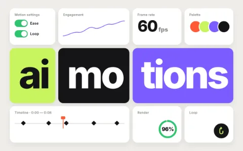
bento grid · bento box layout · feature grid animation · card grid reveal
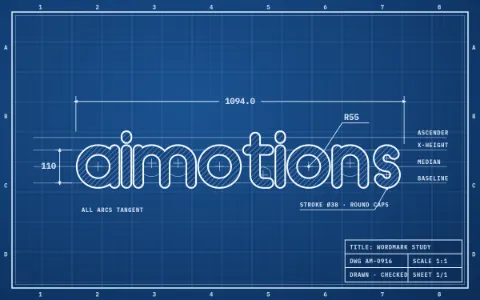
blueprint animation · technical drawing · engineering drawing · drafting lines
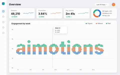
data visualization animation · dashboard animation · chart animation · infographic motion
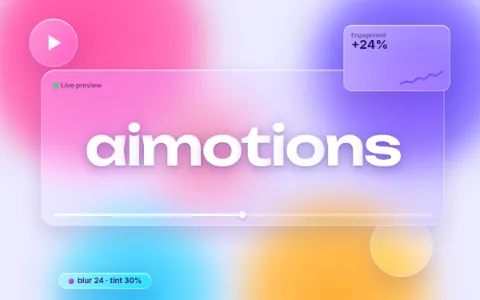
glassmorphism · frosted glass ui · glass card effect · blurred glass
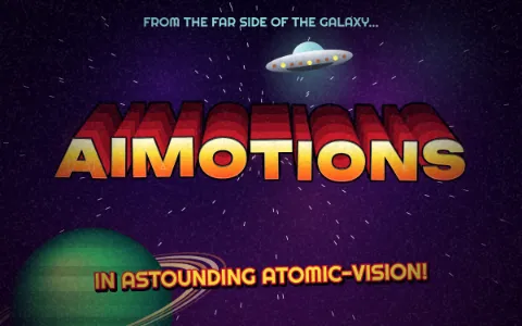
1950s sci-fi title · b-movie title · retro sci-fi poster · flying saucer intro
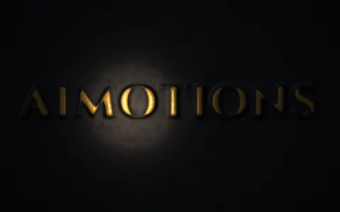
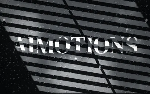
film noir title · venetian blind shadows · noir lighting · black and white detective
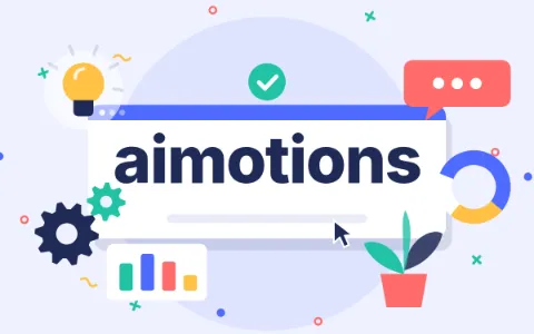
explainer video · corporate motion graphics · flat design animation · saas explainer
art nouveau text · whiplash curve · floral ornament frame · belle epoque poster
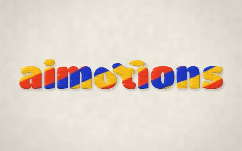
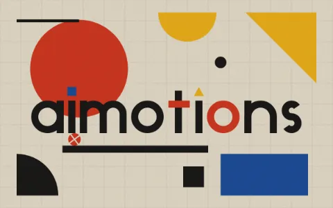
bauhaus style · geometric poster · primary colors design · circle square triangle
No paywall, no sign-up. If a prompt saved you an hour, a coffee keeps new styles coming.
Pick a style on aimotions, click “Copy for website title”, replace [TEXT] with your title and paste the prompt into a frontier AI model (Claude Opus 5.5, Claude Sonnet 5.5, Claude Fable 5.5, GPT-6 Astra or GPT-6.1 Sol, or newer). You get a self-contained HTML, CSS and JavaScript snippet to paste into your page or a custom HTML block, or a component if you ask for one for your framework.
No, as long as the words remain real text in the page HTML, inside a heading. What hurts is putting the title only inside an image, a video or a canvas. The aimotions website title brief asks for this explicitly.
CSS and SVG effects cost almost nothing. Canvas and WebGL effects are heavier, so they should start after the text is shown, pause off-screen and render at a moderate resolution. All of that is part of the brief.
Calm or lively styles with high contrast, like the ones picked on this page: kinetic typography, a neon sign, extruded 3D or paper letters, clean interfaces. For portfolios and launches, reactive styles that respond to the cursor work especially well.
Yes. The brief asks for fluid sizing from 360 px screens, and the prompts of reactive styles ask for the effect to follow the finger on touch screens.
Yes. The prompts are free to use in personal and commercial projects, and aimotions claims no rights over what you make with them. Just check that any typeface the result uses is licensed for the web.
aimotions has no paywall and no sign-up. It is funded by people who found a style they love. A coffee on Ko-fi helps pay for hosting and the next batch of styles.